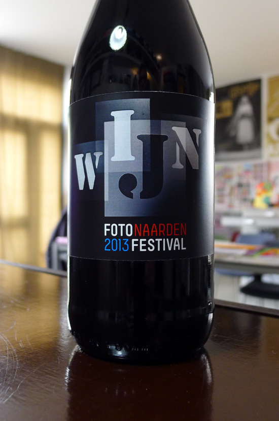
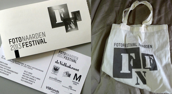
FFN 2013 - identity
A small but flexible identity for the bi-annual ‘fotofestival naarden’ taking place in early summer of 2013 with a series of logos and typographic variations
FotoFestival Naarden, 2013
identity for a bi-annual photo festival in The Netherlands
identity for a bi-annual photo festival in The Netherlands
A small but flexible identity for the bi-annual ‘fotofestival naarden’
taking place in early summer of 2013 with a series of logos and
typographic variations
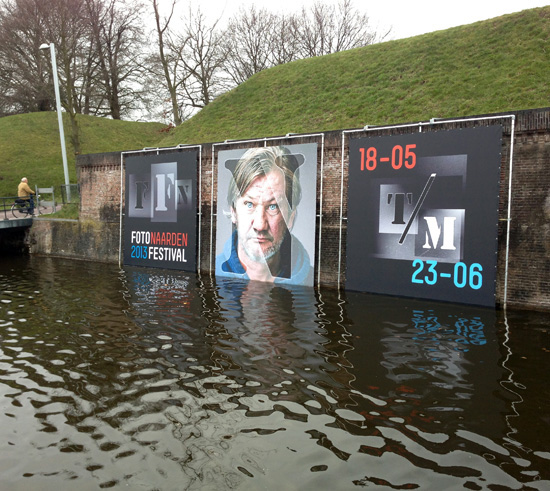
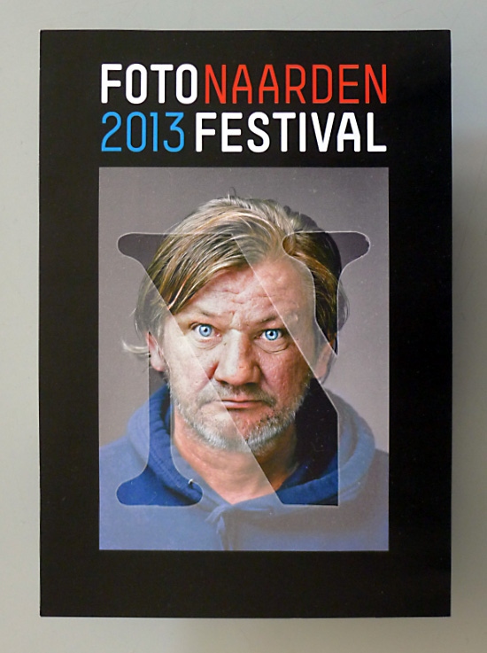
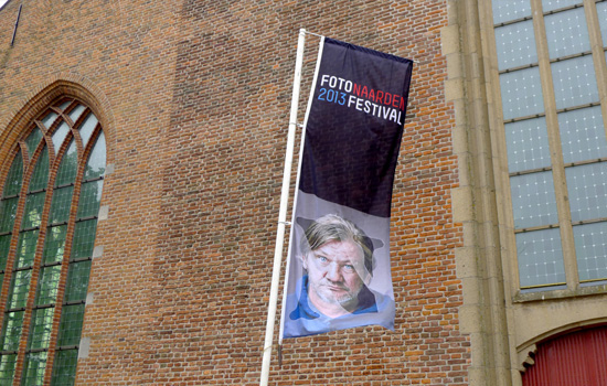
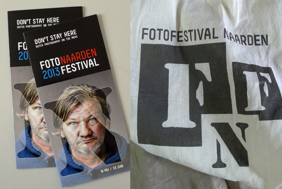
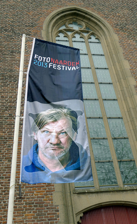
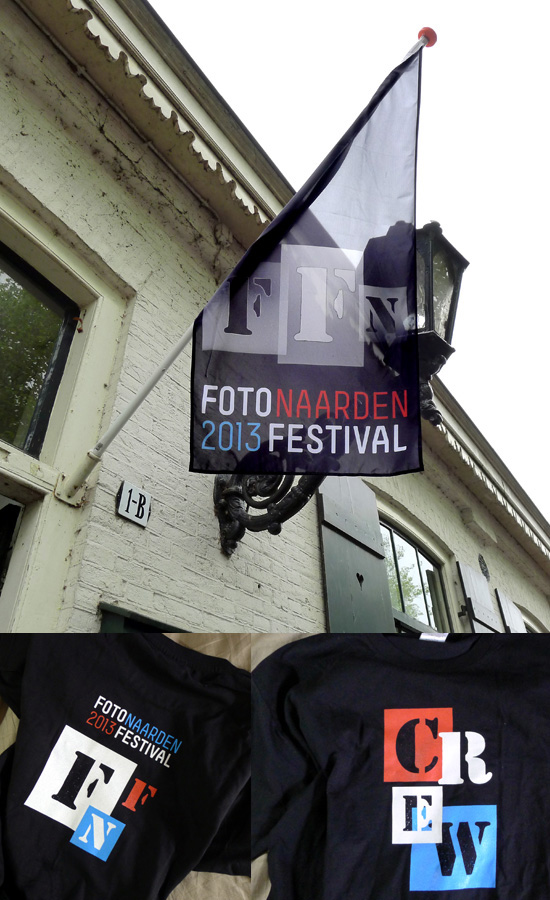
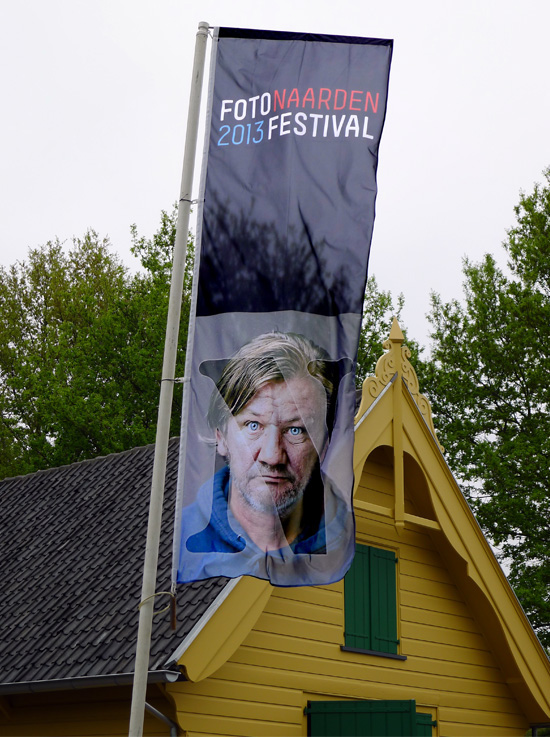
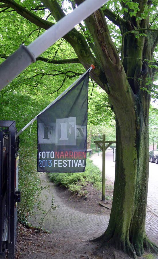
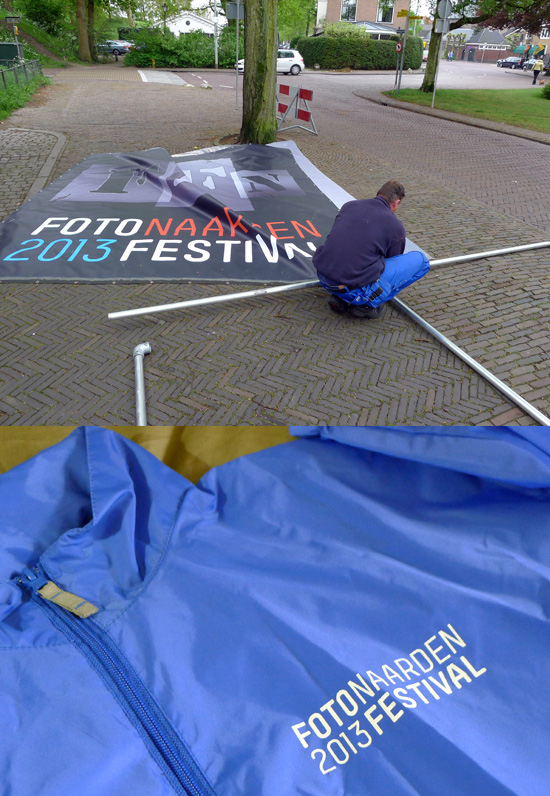
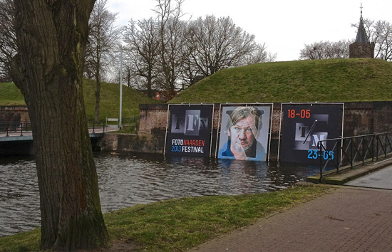
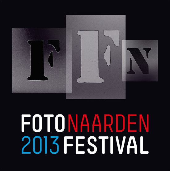
This renowned open-air photo festival takes place in the small
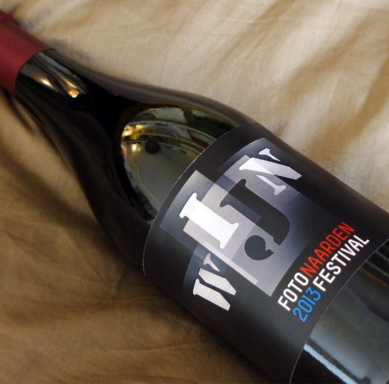
town of ‘naarden’ every two years… the typo treatment is based on
the idea of the initial letters being photographed too, the font
was made using a set of old plastic stencils i’ve had hanging
on the studio wall for a few years now…
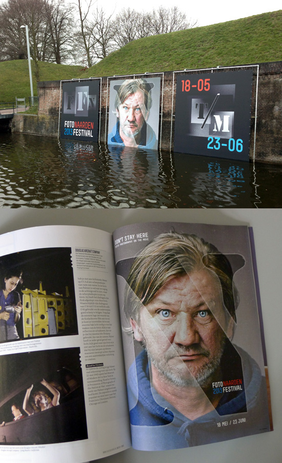
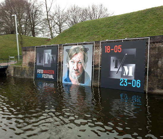
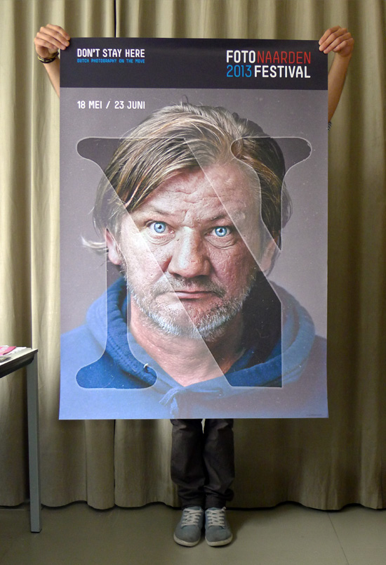
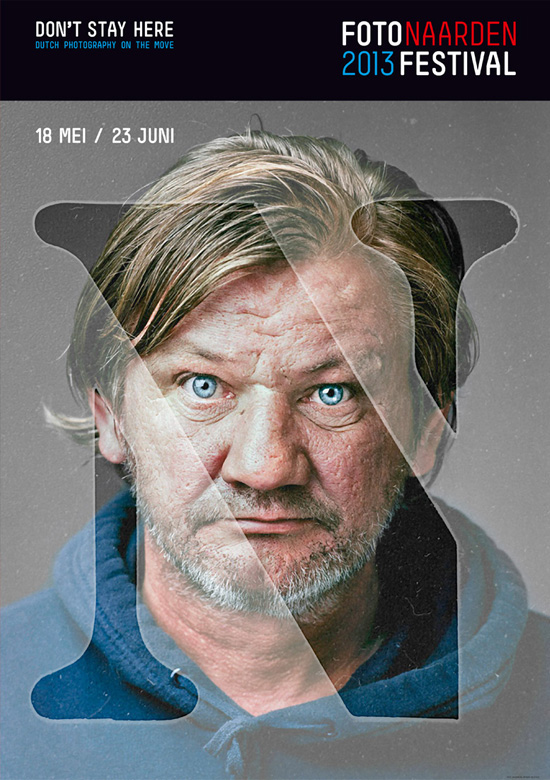
The theme for this years’ festival is ‘don't stay here – dutch
photography on the move’ featuring a wide array of dutch
image makers including ‘jan banning’ whose ‘homeless man’
image (shown) will be used as the central image for the festival
& posters etc… the colour scheme obviously relates to the
‘dutch’ theme chosen for the 2013 festival and is visually
related to the previous edition through the use of the same
stencil font with a different look this year.