FFN 2011 - identity
a corporate identity project, for a bi-annual open-air photo festival in the netherlands (2011)
FotoFestival Naarden, 2011
identity for a bi-annual photo festival in The Netherlands
identity for a bi-annual photo festival in The Netherlands
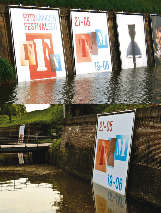
A small but flexible identity for the bi-annual ‘fotofestival naarden’
taking place in early summer of 2011 with a series of logos and
typographic variations
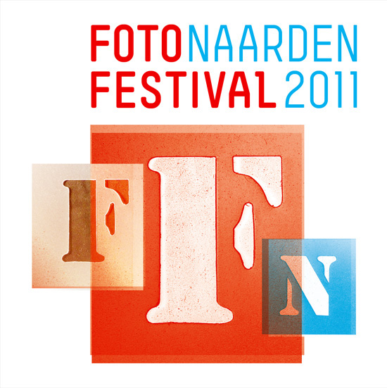
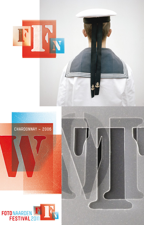
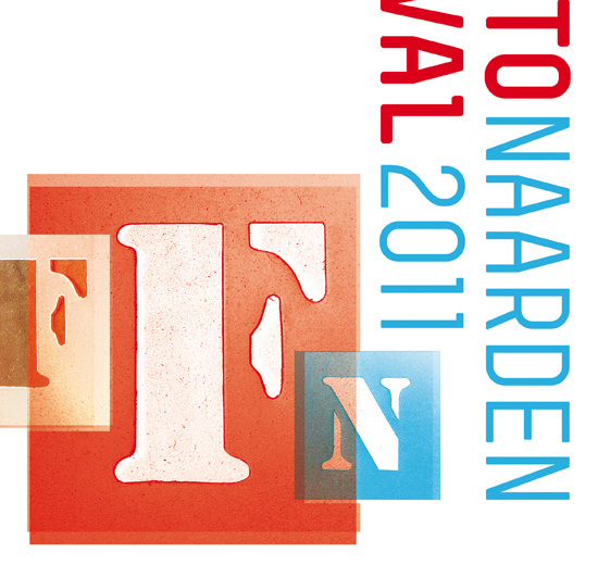
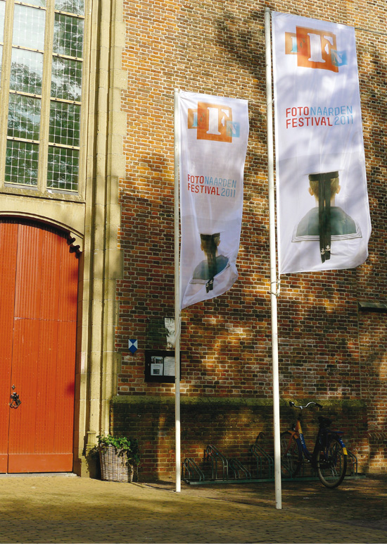
This renowned open-air photo festival takes place in the small
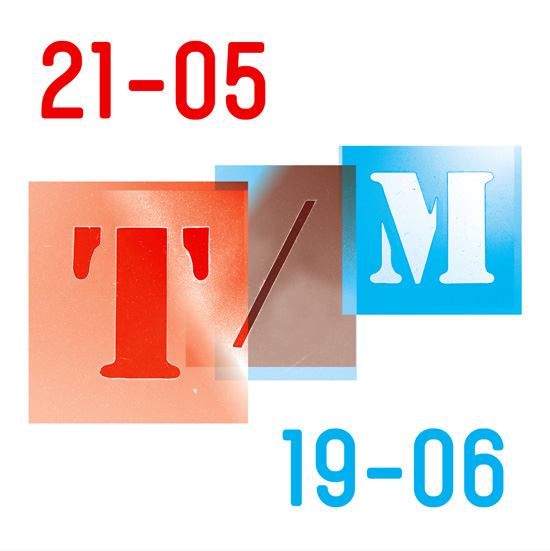
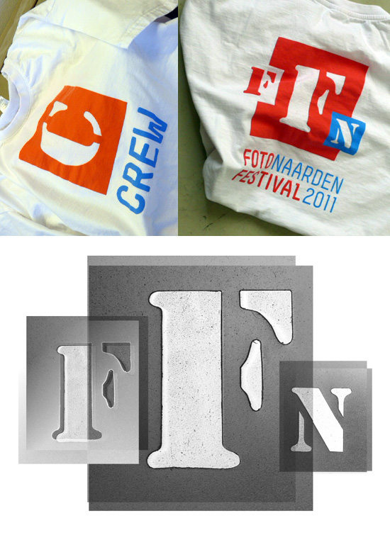
town of ‘naarden’ every two years… the typo treatment is based on
the idea of the initial letters being photographed too, the font
was made using a set of old plastic stencils i’ve had hanging
on the studio wall for a few years now…
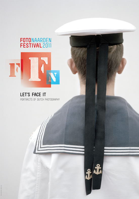
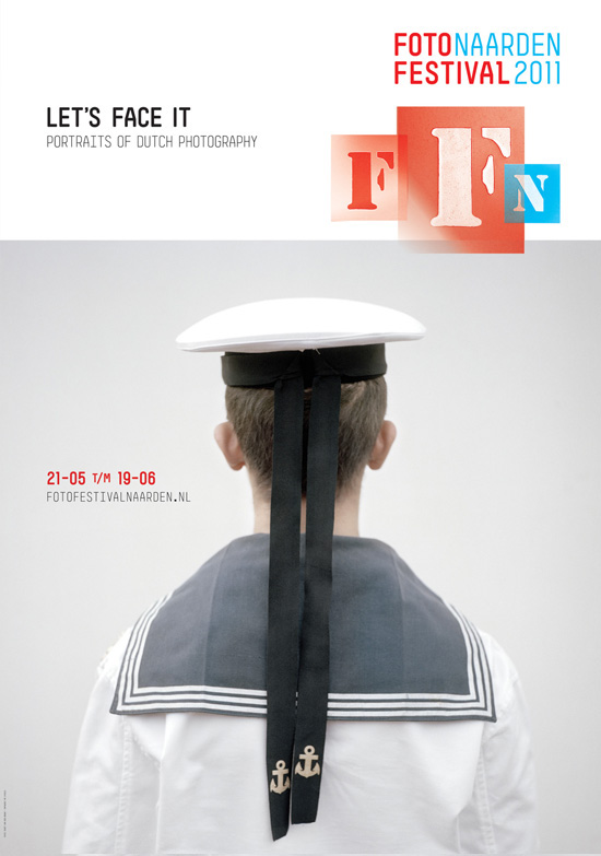
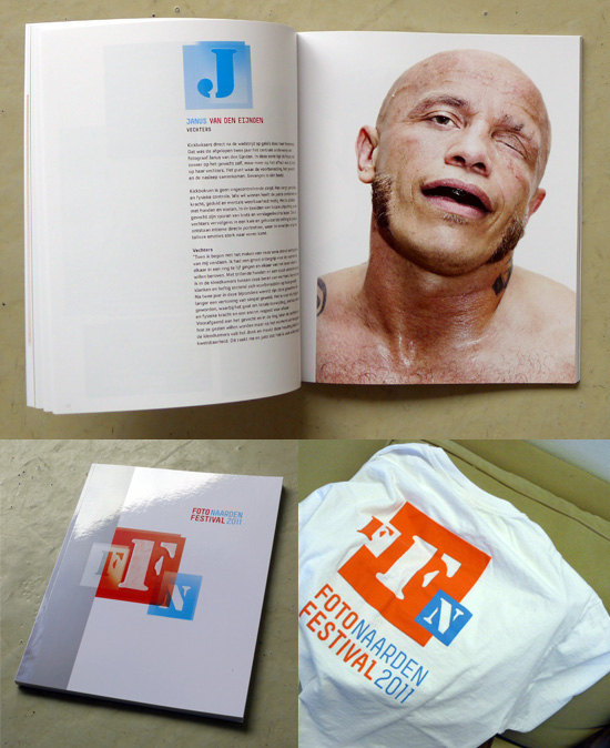
The theme for this years’ festival is ‘let’s face it – portraits of
dutch photography’ featuring a wide array of dutch image makers
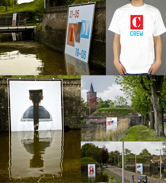
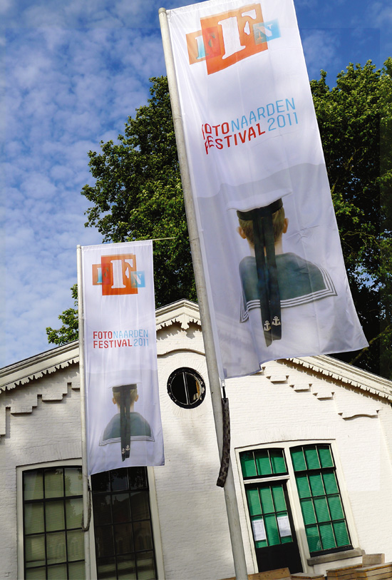
including ‘joost van den broek’ whose ‘sailor’ image (shown)
will be used as the central image for the festival & posters etc…
the colour scheme obviously relates to the ‘dutch’ theme
chosen for the 2011 festival.
(also see the 'naarden 2011' book and website in my behance portfolio)
taking place in early summer of 2011 with a series of logos and
typographic variations
This renowned open-air photo festival takes place in the small
town of ‘naarden’ every two years… the typo treatment is based on
the idea of the initial letters being photographed too, the font
was made using a set of old plastic stencils i’ve had hanging
on the studio wall for a few years now…
The theme for this years’ festival is ‘let’s face it – portraits of
dutch photography’ featuring a wide array of dutch image makers
including ‘joost van den broek’ whose ‘sailor’ image (shown)
will be used as the central image for the festival & posters etc…
the colour scheme obviously relates to the ‘dutch’ theme
chosen for the 2011 festival.
(also see the 'naarden 2011' book and website in my behance portfolio)